
Since 1985, USAID’s Child Survival and Health Grants Program (CSHGP) has invested in a strategic partnership model to support initiatives which accelerate reductions in maternal, newborn, and child mortality at the community, national and global levels in priority countries. Over its 32 year history CSHGP program (which closed in 2017) achieved many health milestones while impacting over 221 million beneficiaries across 65 countries. The program deployed $658 million USD in funding, $206 million of which was contributed by outside partners. The program also built upon a robust set of data to measure and evaluate its impact. This project looked to translate this body of data into a compelling infographic that effectively communicates the reach and impact of the CSHGP program.
““Information can be useful—and even beautiful—but only when it’s presented well. In an age of information overload, any guidance through the clutter comes as a welcome relief.””
Through the concepting and design of an infographic report, this support helped to visualize program data collected over three decades to communicate the impact of CSHGP investments, across the following categories:
- Broad health impact across the full range of maternal / child health needs
- Increased global reach and scale over time during the life of the program
- Strong partnership model with substantial leverage coming from matching funds
- Community-level emphasis with most of the program efforts directed at the neediest and more vulnerable
- Rigorous measurement and evidence-based outcomes tracked throughout lifetime of the program
This project brought a human-centered design approach to this challenge to ensure that the final design met the needs of key users and influencers in the global health community. This approach, outlined in detail below, focused on working with end users to create an infographic that is both useful and easy to understand.

Immersion:
To garner a foundational understanding of CSGHP and its impacted stakeholders, the project began with interviews of the CSGHP team and potential users within the global health community to better understand the type of visual narrative that would be both consumable and useful to this technical audience. Similar infographics were studied and vetted for their simplicity, usefulness, and visual savvy. This initial desk research helped to support a more formal and iterative user research and concepting phase.
““But the reason for looking at an infographic in the first place is its usefulness. If it is useful, there is a reason to read it. If it is useable (in the UI design sense) you will actually be able to understand it. Make it both.” ”
Research:
To fully understand the intended goals and external uses for this infographic, visual research was expanded outside of the primary infographic space, surveying a broad range of examples like data visualizations and long-form narratives which conveyed the longitudinal impact of programs and interventions. Comparable visuals were compiled and then mapped these examples to the raw data to ensure a good fit. After several iterative sessions the following list of visual components was decided upon:
- Map (to represent geographic coverage)
- Continuum of Care (to represent health lifecycle coverage)
- Program Timeline (to represent key milestones and events)
- Pyramid (to represent coverage across the health system hierarchy)
- Icons (to represent beneficiary mix)
- Bar graph (to represent intervention priorities)
This initial list led to the creation of a mood board of comparable visual examples (e.g. maps, timelines) that were vetted prior to concepting. For each of the six elements above, 4-5 visuals were identified as references and solicited client input before beginning to build out the individual components of the infographic with real data from CSGHP.

Concepting:
Many stakeholders were involved throughout the sketching and design process, providing relevant feedback on the concepts as they emerged. A visual team focused on one component at a time, using low-fidelity wireframes to first gather client feedback on wording, hierarchy, and usefulness before adding the final graphic polish. At the same time, the design began concepting and sketching a visual architecture for the combined infographic to ensure that the narrative and information hierarchy was succinct. As each component was finalized they were then integrated into the larger infographic to ensure a satisfying and balanced visual result.


Strategy:
The final visual execution brings together many layers of information into a satisfying and meaningful whole. Each component was built using real data provided by the CSGHP to ensure that it communicates accurately and effectively to the intended audience, as follows:
1. Map showcases the geographic coverage of the program in 65 countries, beneficiaries reached, and investments made. This concept overlays overall beneficiary data, onto the background funding data. The beneficiary data is represented by bubble size and color to provide a clear visualization of the correlation between beneficiaries impacted vs. dollars invested at a country level.
2. Beneficiary data is visualized to further convey its human impact on mothers and children over thirty years. Data was aggregated relative to mothers and children and represented them in icons. This provided additional insights into the human impacts of the program at a beneficiary level.
3. Investment matching is represented in a pie chart format. This communicates the strong engagement of the CSHGP program partners and the correlation of USAID financing and PVO matches across 65 countries for 3 decades.

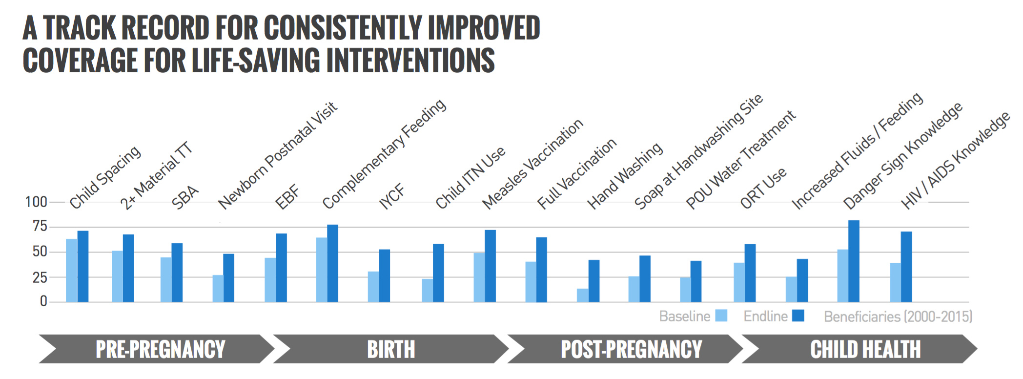
4. Continuum of Care is used as a visual spine and represented in a bar chart to show changes in the intervention coverage from baseline to endline at each life stage across the 30 years of the program. Color was used to highlight the increase in coverage for each indicator across the continuum and provide a precise picture of the impact of the program from a standard baseline.
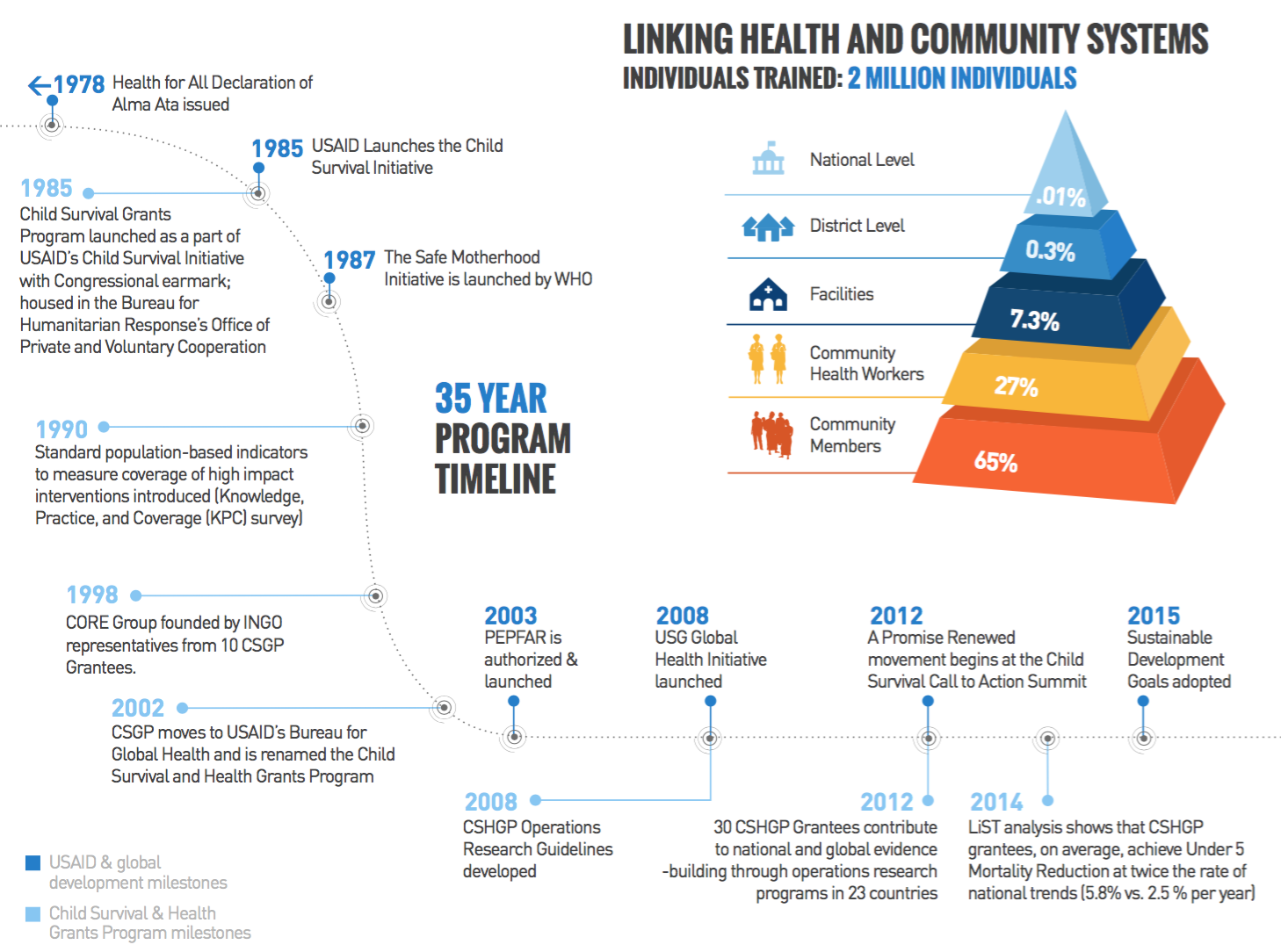
5. Program Timeline is used to represent the three-decade journey of the CSHGP program. The timeline communicates the scope and impact of the program over time as a strong visual frame to bring together different milestones and datasets. The top layer is devoted to the USAID and globals development milestones and the bottom layer to the CSHG specific milestones.
6.Training is represented as a pyramid chart, with the data mapped to different levels of the health system, from national Ministries of Health down to the community level. This demonstrates the strength of the program, with its ability to touch each of these levels, as well as the strong emphasis on impact at the community level. This visual hierarchy is represented through color and total number of individuals trained as an emphasis of the program.
Click here to download the latest version of the CSHGP infographic: